Thursday, September 11, 2014

Indiana Fields

Black and white thumbnails are a great way to study value, but color thumbnails can help explore color relationships.
These are studies from a memory I had from a recent trip home from an art fair in Bloomington, IN. I also took some snapshots with my cellphone of sunset clouds. Cellphone images aren't great but the distortions can add to the creative process. Don't copy, just use the photo to trigger memories.

color studies for "Indiana Fields"

"Indiana Fields1" 8"x12" pastel

"Indiana Fields2" 8"x12" pastel


Mowing study

In July I took a weeklong workshop at Arrowmont Arts and Crafts School in Gatlinburg, TN with the pastel artist Susan Ogilvie. It was an amazing week and I'm trying to apply what I've learned.
Of all the things I learned, composition and thumbnail sketches have impacted my ideas the most. 
Yes, everyone knows we're suppose to create thumbnail sketches to study the images for value and composition, but very few of us do it.
Here's the black and white thumbnail I created to study the elements.
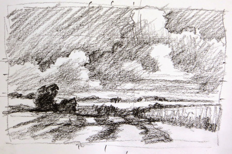

black and white study from Shaker Village fields
The cloud section of this painting was created as a plein air piece at Shaker Village this month, but the bottom of the plein air didn't work well. I rubbed out that portion. Then after studying a photograph that I took at Shaker Village the year before, I combined the two images and created "Mowing 2". Confused? 
Well, that's another thing I learned in the workshop - combine images to create a better composition. I plan on talking more about these things in upcoming blogs.
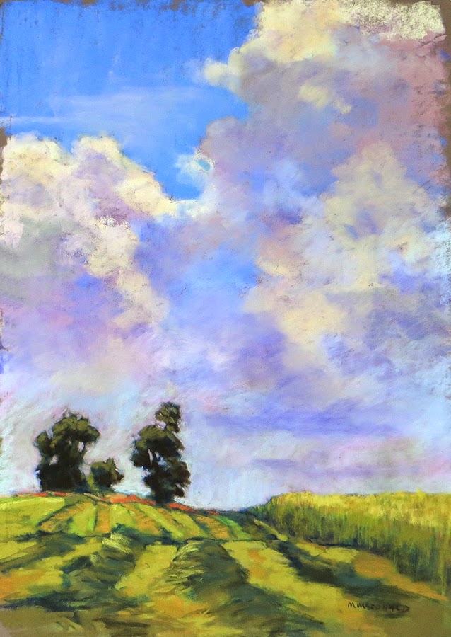
"Mowing 1" 16"x12" pastel on dark gray  PastelMat

This is another image from the thumbnail study.
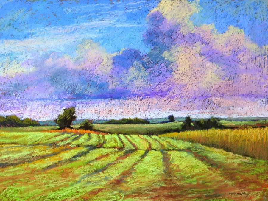
                           
"Mowing 2" 12"x16" pastel on textured sanded paper


Sunday, February 9, 2014

Pastel Workshop Demo Piece

Hello all,
While finishing my demo piece I decided I didn't need another just like the step by step image so I decided to crop this one to fit into a 12"x16" frame.
What do you think?
I think by cropping out the top of the tree and the mountain top, the viewer's eye is focused more on the light as it moves across the road to the grass and tree trunk. The orange leaves and light colored tree branch brings the eye back into the picture.
"Big Maple" demo piece 8"x12" pastel


Pastel Workshop Follow-up

"Mingo Road Big Maple" 12"x16" pastel
Thanks to everyone who attended my "Beginner/Intermediate Pastel Workshop" at Artists Attic this past Saturday. What a great and dedicated group of artists. A real pleasure to teach.
As promised, here's the final image, the photograph and the step-by step printout. 

I'm working on finishing up my demo piece from the workshop and will post it in a later entry.
Thanks again for a truly delightful Saturday.
Reference photograph for "Mingo Road Big Maple"
Steps to create "Mingo Road Big Maple"

Sunday, December 8, 2013

End of Autumn 2

I'm in a blogging frenzy.

Here's the second of the "End of Autumn" series. It's still slightly in transition since I'm working on "End of Autumn 6" which is also of moving water. I'd like the color of the 2 pieces to work together.

That's one of the many pluses of working with pastel. The pieces can always be adjusted and reworked (unlike watercolor). The problem comes if I overwork and ruin the energy of piece.

"End of Autumn 2" 18" x 26"

The Close-up Series

Yep, it's me again. 2 blogs in one night. woo-hoo. The only way to remember changes is to do it at least 2 times in one night. 

So now I've moved over to the laptop where I have most of my new pieces stored. Yes, I know there's a "cloud" to help jump back and forth from desktop to laptop, and my brain is there all the time. Unfortunately is not the part of the brain that stores computer information.

So here's the first in the "Close-up" series.

"End of Autumn 1" 18"x26" pastel

The "End of Autumn" series was inspired by a trip this fall to Swift Camp Creek which runs into Red River at the Gorge. I have completed many plein air drawings of the creek and hiking trails but have always been intrigued by the intimacy of the creek with the silt covered rocks, sinking leaves, leaves floating on the top and light reflections on the surface. Very complicated and not something I wanted to try in a 2 hour plein air session. So I snapped tons of photos - I just love, love, love digital photography. I like enlarging and cropping shots until I get the interesting composition I need.

In the studio I can study the many photos and work slowly with careful selection of colors and composition.

Way Too Long

Hello to the blogasphere,

It's been way too long since I blogged-February-now that's embarrassing. So much has happened.

1st - I moved my studio to the building that's houses LexArts: the umbrella org for the all the arts in Lexington. Neat place to be but I miss the art crew at Artists Attic.
2nd - In September my husband and I travelled to the southwest, visiting Santa Fe, Taos, Painted Desert and the amazing Grand Canyon.
3rd - In October our very sweet friends ask us to join them in Kauai, Hawaii for the 2nd week of their vacation. Again an amazing place and yes, I tried to surf but managed only to get up on my hands and knees. Oh well, at least I tried.

I'll be posting some pastels from my trips and some new pastels from my "close-up" series which started with creek images from Red River Gorge.

Now I have to remember how to attach photos. :-) It only took me 20 minutes to get logged in - the old forgetting my password and all the changes due to the lovely Time Warner Cable change over from Insight.

I do love winter. It's a quiet, contemplative time and I plan on working daily AND posting many of my new pieces.

Just to get back into the swing of things I'll post the image I'm using on my new business cards.
"Shaker Trail" pastel 14"x30"