Tuesday, February 16, 2016

Shaker Village Inspirations

It's been much too long since my last blog and as I reread previous posts I had to smile. My last post was December 2014 and it was an image from Shaker Village. 

In February 2015, Shaker Village opened studio space to artists and I was selected to participate in the new program. I moved my studio to Shaker Village, East Family Brethren Shop, in April and it's been an excellent experience. 

My studio is flooded with natural light from six 4 foot tall windows. I talked to Shaker Village visitors and I work on new pastels or oils. It's my gallery and my working studio.

When it's just too beautiful to stay in the studio I lock the door and go out to the 3000 acres of Shaker Village property to create plein air drawings. There's nothing like working from a live model - the land.
"Partly Cloudy" 8"x8" pastel

Wednesday, December 3, 2014

"Simple"

Shaker Village at Pleasant Hill is one of my favorite places to work. When I go there I draw "en plein air" and I take lots of reference photos for later studio work especially when the weather in Kentucky does not lend itself to the outdoor experience.

A favorite Shaker song written by Joseph Brackett goes
"Tis the gift to be simple, Tis the gift to be free
Tis the gift to come down where we ought to be"

And I think about choices for subject matter for art. I come down on the side of "simple", not big thoughts or esoteric meanings; just images that touch my heart and isn't that what it's all about. Finding beauty in the quiet places of life.

This is a carriage trail in Shaker Village and it use to be the main road from Harrodsburg, KY to Lexington, KY. The Shakers used it to take their products to market and as I stand on this road I think of all who travelled along it's gravel path.

pastel and alcohol wash underpainting on UART sanded paper

Adding NuPastel and Sennelier pastels for next layers

"Simple Trail - Shaker Village" 8"x12" pastel

Tuesday, November 18, 2014

Photos - Reference, Inspiration or Both

When I can't work directly outdoors I use my own reference photos. These are handy when time is short or the light is fading quickly and I don't have enough time to complete a plein air pastel.

I always work from my own reference photos except when doing animal or property portraits for a customer. The photo helps me recall the feeling of the place and reminds why I was excited about the scene. My b/w sketches also help.

But I'm surprised when I view the reference photo after the studio piece is completed and see how much I interpreted rather than copied the photograph.

Here is the pastel "End of Autumn 3" that I showed in the last blog.

"End of Autumn 3" 18"x24" pastel

And here's my reference photo as well as the cropped version of the photo. Cropping in photoshop is an invaluable compositional tool.

Swift Camp Creek Fall Reflections


The completed pastel may seem photorealistic but as you can see by comparing it to the reference photo, the photo is as much an inspiration as a reference.

Friday, November 14, 2014

Working in a series

Sometimes is easier to find your own "visual voice" by working in a series and exploring the same topic from different angles or visions.

"End of Autumn 2"
Last fall I took a series of up-close images of leaves floating down Swift Camp Creek. The topic was mesmerizing, quiet and contemplative. I took lots of photographs just enjoying the process without actually thinking about using the images for a series. But when I loaded the images onto the computer and started enlarging areas and cropping for better composition I realized I had a lot of subject matter that related in a series. 

"End of Autumn 5"
"Nearby Creeks-End of Autumn" series began. As with all efforts some of the pieces are more successful than others but this series hit a high note. "End of Autumn 5" was accepted to the Pastel Society of America annual show in New York and "End of Autumn 3" won 5th place/landscape in the Pastel 100 contest sponsored by Pastel Journal.

"End of Autumn 3"
Years ago a friend of mine sent me a postcard that says, "Success is largely a matter of hanging on after others have let go." I still have it tacked to my bulletin board and think about the low times when I wanted to quit but just couldn't. Glad I didn't.

The entire series can be viewed on my website, Mcdonaldfineart.com.


Thursday, November 6, 2014

Wilderness Road Farmhouse

Last night I mistakenly posted on my old Pastel Lessons blog. That's what happens when I post at 10:30 pm.
So here's what should have been on this site.

Last week my husband and I took our mountain bikes to Cumberland Gap area and rode on the Wilderness Trail. I spotted this farm and loved the rhythm of the barns, the golden maples and the farmhouse.

This pastel is done on UArt sanded paper with pastel and alcohol wash underpainting. UArt is very versatile paper which accepts watercolor and thinned oil washes as well as the alcohol type underpainting without warps or buckling. Because it only comes in cream color and I like to have a colored underpainting to make the pastel pop.

After considering what I thought was the final piece I felt like too many of the angles of shapes were headed in the same direction. They needed a counter-balance - not strong, just a subtle shift in colors and shapes. I changes some of the shapes and colors in the foreground field. I think it's finished but with pastel is always easy to rub out and change things.

"Wilderness Road Farm" step one - underpainting

"Wilderness Road Farm" 11"x14" pastel

"Wilderness Road Farm" 11"x14" pastel final

Thursday, October 9, 2014

Autumn Red

This drawing just wasn't working.  I was in West Virginia with my friend Joy and I spotted this group of trees beginning to turn red. There was almost an even mix of red and dusty greens and the light was very overhead. I worked on it and got disgusted. With a paper towel I wiped out my feeble efforts. Yes, sometimes it's a good idea to just start over.
"Red Autumn" wiped out
Back in my studio in Kentucky, I was determined to make this image work. First I studied the photo and did another black and white thumbnail sketch. (I did one on site also, but worked harder on this second drawing and you can see where I erased some of the sketch and redesigned the location of the shapes.
Thumbnail sketch of "Red Autumn"


Next, I started reworking the image focusing on the values from my sketch and changing the main tree to a dominate red.
"Red Autumn" midway finished
In the final image I focused on developing the brilliant reds with late afternoon light and made the tractor path a secondary element.
"Red Autumn & Tractor Path" 12"x16" pastel

Thursday, September 18, 2014

Fading Light

"Fading Light" as inspired by a small portion of a photo I took at Shaker Village as the sun set on the west side of the property. 
While studying the photo to use as reference for another pastel I noticed how the light ran across the top of the hillside and illuminated the top of the house. The fields and trees created an abstract pattern of interest.
First I created some black and white sketches to study the shapes and values.
"Fading Light" sketches

Then because the distant scene was colored lightly by fading light and summer haze, I needed to enhance the colors giving me a chance to interpret instead of just copying nature. These little color sketches are only 4"x6".

"Fading Light" color sketches


Finally I chose my favorite sketches and combined the best of each to create a larger 8"x12" pastel drawing.

"Fading Light" 8"x12" pasel

Thursday, September 11, 2014

Indiana Fields

Black and white thumbnails are a great way to study value, but color thumbnails can help explore color relationships.
These are studies from a memory I had from a recent trip home from an art fair in Bloomington, IN. I also took some snapshots with my cellphone of sunset clouds. Cellphone images aren't great but the distortions can add to the creative process. Don't copy, just use the photo to trigger memories.

color studies for "Indiana Fields"

"Indiana Fields1" 8"x12" pastel

"Indiana Fields2" 8"x12" pastel


Mowing study

In July I took a weeklong workshop at Arrowmont Arts and Crafts School in Gatlinburg, TN with the pastel artist Susan Ogilvie. It was an amazing week and I'm trying to apply what I've learned.
Of all the things I learned, composition and thumbnail sketches have impacted my ideas the most. 
Yes, everyone knows we're suppose to create thumbnail sketches to study the images for value and composition, but very few of us do it.
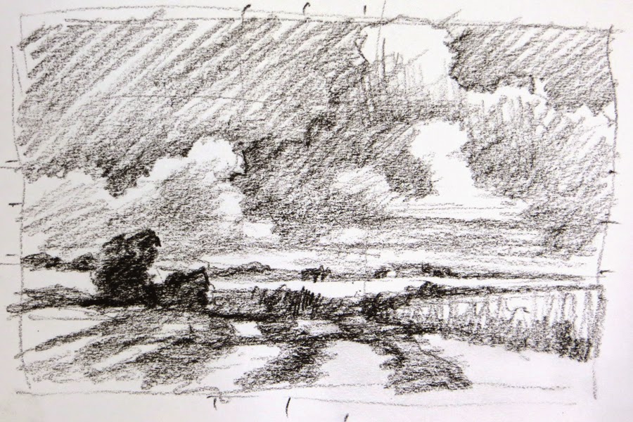
Here's the black and white thumbnail I created to study the elements.


black and white study from Shaker Village fields
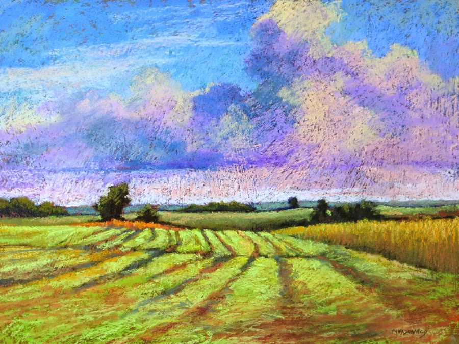
The cloud section of this painting was created as a plein air piece at Shaker Village this month, but the bottom of the plein air didn't work well. I rubbed out that portion. Then after studying a photograph that I took at Shaker Village the year before, I combined the two images and created "Mowing 2". Confused? 
Well, that's another thing I learned in the workshop - combine images to create a better composition. I plan on talking more about these things in upcoming blogs.
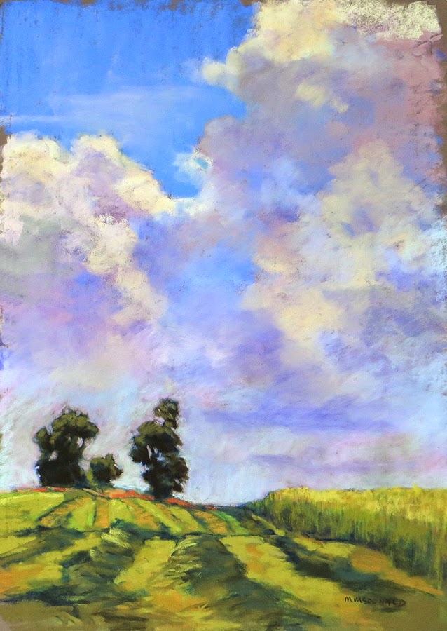
"Mowing 1" 16"x12" pastel on dark gray  PastelMat

This is another image from the thumbnail study.
                           
"Mowing 2" 12"x16" pastel on textured sanded paper


Sunday, February 9, 2014

Pastel Workshop Demo Piece

Hello all,
While finishing my demo piece I decided I didn't need another just like the step by step image so I decided to crop this one to fit into a 12"x16" frame.
What do you think?
I think by cropping out the top of the tree and the mountain top, the viewer's eye is focused more on the light as it moves across the road to the grass and tree trunk. The orange leaves and light colored tree branch brings the eye back into the picture.
"Big Maple" demo piece 8"x12" pastel


Pastel Workshop Follow-up

"Mingo Road Big Maple" 12"x16" pastel
Thanks to everyone who attended my "Beginner/Intermediate Pastel Workshop" at Artists Attic this past Saturday. What a great and dedicated group of artists. A real pleasure to teach.
As promised, here's the final image, the photograph and the step-by step printout. 

I'm working on finishing up my demo piece from the workshop and will post it in a later entry.
Thanks again for a truly delightful Saturday.
Reference photograph for "Mingo Road Big Maple"
Steps to create "Mingo Road Big Maple"

Sunday, December 8, 2013

End of Autumn 2

I'm in a blogging frenzy.

Here's the second of the "End of Autumn" series. It's still slightly in transition since I'm working on "End of Autumn 6" which is also of moving water. I'd like the color of the 2 pieces to work together.

That's one of the many pluses of working with pastel. The pieces can always be adjusted and reworked (unlike watercolor). The problem comes if I overwork and ruin the energy of piece.

"End of Autumn 2" 18" x 26"

The Close-up Series

Yep, it's me again. 2 blogs in one night. woo-hoo. The only way to remember changes is to do it at least 2 times in one night. 

So now I've moved over to the laptop where I have most of my new pieces stored. Yes, I know there's a "cloud" to help jump back and forth from desktop to laptop, and my brain is there all the time. Unfortunately is not the part of the brain that stores computer information.

So here's the first in the "Close-up" series.

"End of Autumn 1" 18"x26" pastel

The "End of Autumn" series was inspired by a trip this fall to Swift Camp Creek which runs into Red River at the Gorge. I have completed many plein air drawings of the creek and hiking trails but have always been intrigued by the intimacy of the creek with the silt covered rocks, sinking leaves, leaves floating on the top and light reflections on the surface. Very complicated and not something I wanted to try in a 2 hour plein air session. So I snapped tons of photos - I just love, love, love digital photography. I like enlarging and cropping shots until I get the interesting composition I need.

In the studio I can study the many photos and work slowly with careful selection of colors and composition.

Way Too Long

Hello to the blogasphere,

It's been way too long since I blogged-February-now that's embarrassing. So much has happened.

1st - I moved my studio to the building that's houses LexArts: the umbrella org for the all the arts in Lexington. Neat place to be but I miss the art crew at Artists Attic.
2nd - In September my husband and I travelled to the southwest, visiting Santa Fe, Taos, Painted Desert and the amazing Grand Canyon.
3rd - In October our very sweet friends ask us to join them in Kauai, Hawaii for the 2nd week of their vacation. Again an amazing place and yes, I tried to surf but managed only to get up on my hands and knees. Oh well, at least I tried.

I'll be posting some pastels from my trips and some new pastels from my "close-up" series which started with creek images from Red River Gorge.

Now I have to remember how to attach photos. :-) It only took me 20 minutes to get logged in - the old forgetting my password and all the changes due to the lovely Time Warner Cable change over from Insight.

I do love winter. It's a quiet, contemplative time and I plan on working daily AND posting many of my new pieces.

Just to get back into the swing of things I'll post the image I'm using on my new business cards.
"Shaker Trail" pastel 14"x30"

Sunday, February 10, 2013

State Park pastels

It's been way too long between blogs because I've been working on pastels for 2 one-person shows and a large commission for the new Owensboro Hospital.
So tonight I tried to load up some step by steps from my recent pastel workshop and of course couldn't get it to work. Now I'm back again, trying. You know the definition of crazy is doing the same thing again and expecting a different result. Well computer technology drives me crazy.
So here's a couple of images from my one person show at Artists' Attic, 401 W. Main Street, Victorian Square - 4th floor in downtown Lexington, KY. The reception is Gallery Hop night, Friday, Feb. 15, 5-8pm

"Greenbo Lake Morning Feelings" pastel 24"x30"

"Dale Hollow Reflections" pastel 24"x30"

Wildflower demo steps

hello to all in my latest pastel workshop students.
As promised here are the steps for the Wildflower demonstration and I apologize for working you all so hard. This subject was more difficult than I realized but hey, if it were easy what would you learn? right? :-)

oh, great! I'm having server/internet problems.
I'm going to try to create a folder directly onto my website, www.mcdonaldfineart.com and I'll title it Demos.
keep your fingers crossed.
guess it's time to update the OS on my mac......lordy how I hate tech problems.


Thursday, December 20, 2012

Workshop Information

"Pastels for Beginners" February 9, 9am-4pm, at Artists' Attic, 401 W. Main Street, Lexington, KY 40507
$75.
I'll have a discussion about pastels and then a demonstration followed by a step by step for students to create their own piece.
I will supply the sanded pastel paper but students need to bring their own pastel sets.
Suggested sets are 48 piece set of NuPastels
and if your budget allows I'd suggest the Sennelier 80 1/2 sticks - Plein Air Landscape set which I also use.
To register email me at
marianna.mcdonald@insightbb.com and I'll email you my address to send the workshop fee.

Sunday, November 11, 2012

Trail to LIcking River

"Licking River Trail Evening Light" 24"x18" pastel

"Licking River Trail sketch" 12"x8" pastel

Reference photograph "BlueLicks Trail"

"Licking River Trail Evening Light" is not finished but I like to view things 2/3 the way finished. This is one of those pieces I don't want to overwork and lose the abstracted freshness.

The next image is the sketch I created at BlueLicks State Park when I visited in June. The evening light illuminated the trail and made the vegetation glow. 

And the final image is the reference photograph that I took that evening.

I think its fun to see how the progression of a final piece from photo, to sketch, to studio piece.

Wednesday, November 7, 2012

Upstream at Cumberland Falls

"Upstream at Cumberland Falls"   16"x20" pastel on Uart paper

Upstream in the Morning Cumberland River  photo

Looking through all my reference photos from the Cumberland Falls trip, my eye keeps wandering back to a photo of Cumberland River above the falls. I took the photo early in the morning with the hillside and bridge backlit with morning sun hitting the maple trees and bank. The bridge is barely visible in the background.

In the pastel drawing "Upstream at Cumberland Falls" I pushed the background color to play on complementary colors between the maple tree and riverside against background hillside.

Monday, November 5, 2012

Pines and Maples Evening Light

"Pines and Maples Evening Light" 17"x17" on Uart sanded paper

When I left Natural Bridge the evening light fell on the pines with the darkness of the forest creeping up the valley floor. No time to create a plein air drawing but I snapped lots of photographs.

Bright light hit the maples but to make the drawing work I had to choose to quiet the maples in the background to keep the focus on the pine tree.

I worked slowly today to finish the piece but not overwork it. Adding some color and then leaving the room, re-entering with fresh eyes.