Thursday, November 6, 2014

Wilderness Road Farmhouse

Last night I mistakenly posted on my old Pastel Lessons blog. That's what happens when I post at 10:30 pm.
So here's what should have been on this site.

Last week my husband and I took our mountain bikes to Cumberland Gap area and rode on the Wilderness Trail. I spotted this farm and loved the rhythm of the barns, the golden maples and the farmhouse.

This pastel is done on UArt sanded paper with pastel and alcohol wash underpainting. UArt is very versatile paper which accepts watercolor and thinned oil washes as well as the alcohol type underpainting without warps or buckling. Because it only comes in cream color and I like to have a colored underpainting to make the pastel pop.

After considering what I thought was the final piece I felt like too many of the angles of shapes were headed in the same direction. They needed a counter-balance - not strong, just a subtle shift in colors and shapes. I changes some of the shapes and colors in the foreground field. I think it's finished but with pastel is always easy to rub out and change things.

"Wilderness Road Farm" step one - underpainting

"Wilderness Road Farm" 11"x14" pastel

"Wilderness Road Farm" 11"x14" pastel final

Thursday, October 9, 2014

Autumn Red

This drawing just wasn't working.  I was in West Virginia with my friend Joy and I spotted this group of trees beginning to turn red. There was almost an even mix of red and dusty greens and the light was very overhead. I worked on it and got disgusted. With a paper towel I wiped out my feeble efforts. Yes, sometimes it's a good idea to just start over.
"Red Autumn" wiped out
Back in my studio in Kentucky, I was determined to make this image work. First I studied the photo and did another black and white thumbnail sketch. (I did one on site also, but worked harder on this second drawing and you can see where I erased some of the sketch and redesigned the location of the shapes.
Thumbnail sketch of "Red Autumn"


Next, I started reworking the image focusing on the values from my sketch and changing the main tree to a dominate red.
"Red Autumn" midway finished
In the final image I focused on developing the brilliant reds with late afternoon light and made the tractor path a secondary element.
"Red Autumn & Tractor Path" 12"x16" pastel

Thursday, September 18, 2014

Fading Light

"Fading Light" as inspired by a small portion of a photo I took at Shaker Village as the sun set on the west side of the property. 
While studying the photo to use as reference for another pastel I noticed how the light ran across the top of the hillside and illuminated the top of the house. The fields and trees created an abstract pattern of interest.
First I created some black and white sketches to study the shapes and values.
"Fading Light" sketches

Then because the distant scene was colored lightly by fading light and summer haze, I needed to enhance the colors giving me a chance to interpret instead of just copying nature. These little color sketches are only 4"x6".

"Fading Light" color sketches


Finally I chose my favorite sketches and combined the best of each to create a larger 8"x12" pastel drawing.

"Fading Light" 8"x12" pasel

Thursday, September 11, 2014

Indiana Fields

Black and white thumbnails are a great way to study value, but color thumbnails can help explore color relationships.
These are studies from a memory I had from a recent trip home from an art fair in Bloomington, IN. I also took some snapshots with my cellphone of sunset clouds. Cellphone images aren't great but the distortions can add to the creative process. Don't copy, just use the photo to trigger memories.

color studies for "Indiana Fields"

"Indiana Fields1" 8"x12" pastel

"Indiana Fields2" 8"x12" pastel


Mowing study

In July I took a weeklong workshop at Arrowmont Arts and Crafts School in Gatlinburg, TN with the pastel artist Susan Ogilvie. It was an amazing week and I'm trying to apply what I've learned.
Of all the things I learned, composition and thumbnail sketches have impacted my ideas the most. 
Yes, everyone knows we're suppose to create thumbnail sketches to study the images for value and composition, but very few of us do it.
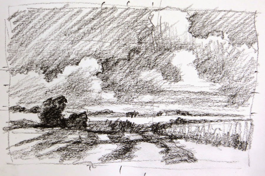
Here's the black and white thumbnail I created to study the elements.


black and white study from Shaker Village fields
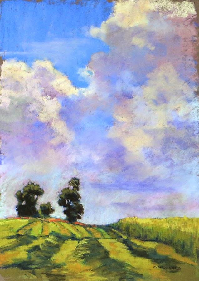
The cloud section of this painting was created as a plein air piece at Shaker Village this month, but the bottom of the plein air didn't work well. I rubbed out that portion. Then after studying a photograph that I took at Shaker Village the year before, I combined the two images and created "Mowing 2". Confused? 
Well, that's another thing I learned in the workshop - combine images to create a better composition. I plan on talking more about these things in upcoming blogs.
"Mowing 1" 16"x12" pastel on dark gray  PastelMat

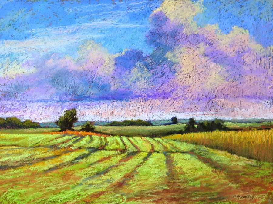
This is another image from the thumbnail study.
                           
"Mowing 2" 12"x16" pastel on textured sanded paper


Sunday, February 9, 2014

Pastel Workshop Demo Piece

Hello all,
While finishing my demo piece I decided I didn't need another just like the step by step image so I decided to crop this one to fit into a 12"x16" frame.
What do you think?
I think by cropping out the top of the tree and the mountain top, the viewer's eye is focused more on the light as it moves across the road to the grass and tree trunk. The orange leaves and light colored tree branch brings the eye back into the picture.
"Big Maple" demo piece 8"x12" pastel


Pastel Workshop Follow-up

"Mingo Road Big Maple" 12"x16" pastel
Thanks to everyone who attended my "Beginner/Intermediate Pastel Workshop" at Artists Attic this past Saturday. What a great and dedicated group of artists. A real pleasure to teach.
As promised, here's the final image, the photograph and the step-by step printout. 

I'm working on finishing up my demo piece from the workshop and will post it in a later entry.
Thanks again for a truly delightful Saturday.
Reference photograph for "Mingo Road Big Maple"
Steps to create "Mingo Road Big Maple"